

Every design discipline publishes an annual trend report except the one whose products last longest. Fashion gets its color of the year; kitchens get their backsplash forecasts; memorial design – a field where Los Angeles quietly leads the country – gets nothing. This report corrects that, compiling what LA families actually commissioned over the past year across the region’s cemeteries, from the historic Eastside grounds to the memorial parks of the Valley and the coastal lawns. Sources: design consultations, installer observations, and the commission patterns visible through the region’s monument studios – the catalog of custom gravestones los angeles families draw from served as this report’s reference index. Six trends defined the year. Here they are, ranked by momentum.
Trend one: the portrait era reaches full saturation. Laser-etched photographic portraiture on polished black granite is no longer a trend in Los Angeles; it is the default, and this year it crossed a threshold – the candid overtook the formal. Families increasingly reject the driver’s-license pose for the laughing photo, the quinceañera dance, the man mid-cast on the pier at Redondo. Designers report coaching sessions that now run in reverse: a decade ago they persuaded families that etching could handle a photo at all; today they persuade them to bring five candids and choose the one with the truest face. The technical driver is etching resolution; the cultural driver is Instagram – a generation that curated its living images expects the same authorship over the permanent one. Forecast: irreversible.
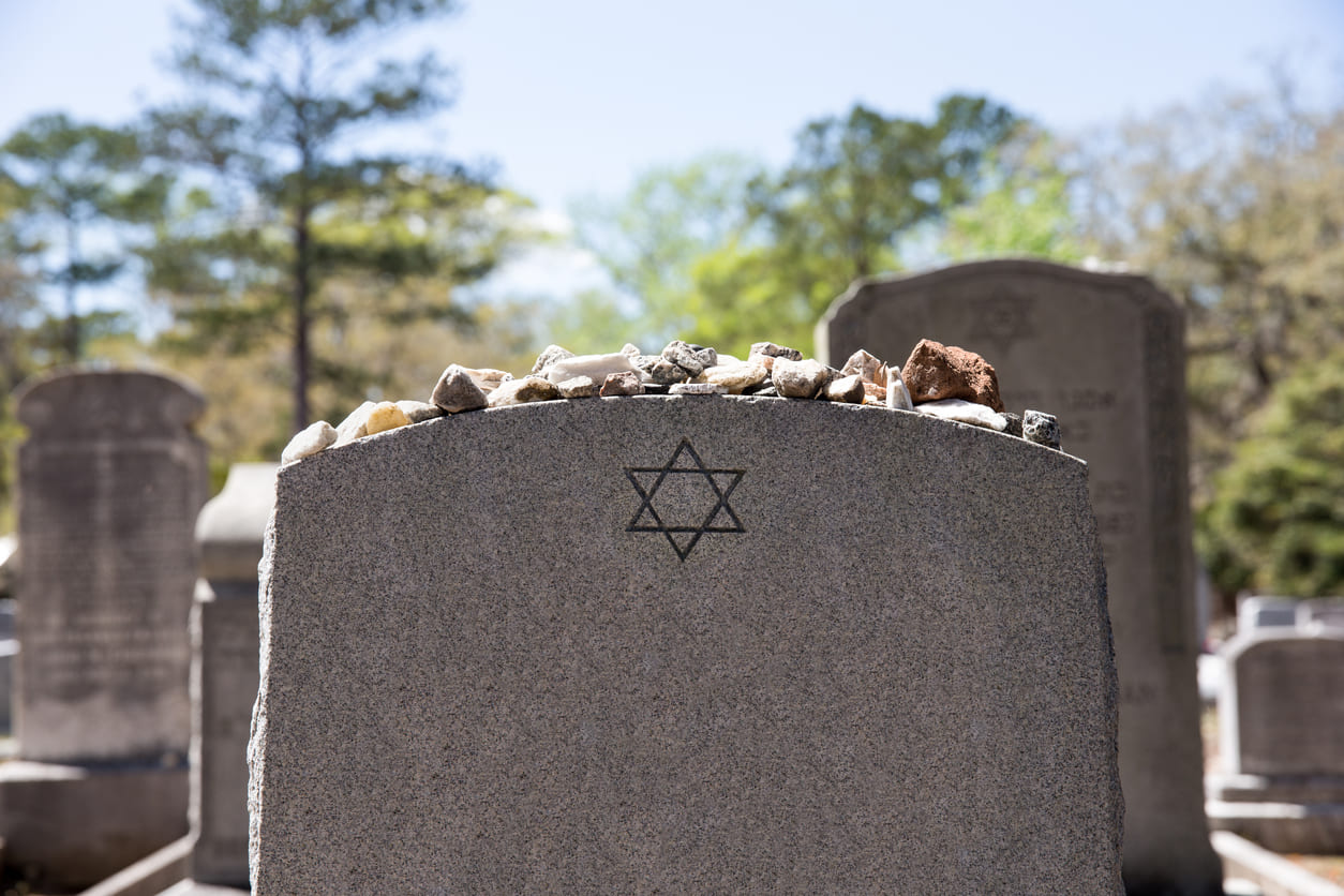
Trend two: bilingual composition grows up. LA has carved two languages on one stone for generations; what changed this year is the design maturity. The old pattern – English layout with a translated line appended – is giving way to genuinely bilingual composition: Spanish and English given equal typographic weight, or the hierarchy deliberately reversed, the Spanish presiding because Spanish was the language the household actually ran on. Armenian-English stones in the Glendale-adjacent grounds, Chinese and Vietnamese vertical-and-horizontal hybrid layouts, Hebrew paired with English in the Jewish cemeteries – the region’s designers now speak of “composing the bilingual page” as its own skill, with native-reader proofing treated as non-negotiable. This report’s assessment: LA’s most exportable memorial innovation, and the rest of the country is importing it.
Trend three: the Guadalupana, rendered finer. The Virgen de Guadalupe remains, by commission volume, the single most requested image in Los Angeles memorial art – no other subject is close – and this year’s development is craftsmanship inflation in the best sense. Families increasingly commission the full iconography at fine-art fidelity: the rays individually cut, the mantle’s stars accurate, the roses at her feet given real depth. Alongside her: the Sagrado Corazón, San Judas Tadeo for the households that kept his candle, and papel-picado-inspired border work that one Eastside designer calls “the most LA design element in the whole catalog.” The report notes the obvious with respect: this is not decoration, it is devotion, and the craft ceiling keeps rising because the families keep asking it to.
Trend four: small stones, maximal design. The cremation majority reshaped the commission mix this year more than any prior year. LA’s cremation rate runs among the nation’s highest, and the resulting monuments – compact uprights, hearts, pedestal stones, generous flat markers over urn plots – concentrated design spend instead of shrinking it. The per-square-inch ambition of this year’s small-format work exceeded the full-size commissions: imported granites, gilding, double-sided engraving, portrait work at intimate scale. The trade’s old assumption that smaller meant simpler died quietly in Los Angeles this year. Forecast: the small-format premium tier becomes its own catalog category within two years.
Trend five: the industry motifs go public. Every city carves its work onto its stones eventually; this year LA stopped being shy about its industries. Film clapboards and reel motifs, guitars and microphones, lowrider silhouettes rendered with automotive accuracy, chef’s knives, union locals numbered proudly, and – a small phenomenon installers began remarking on – the studio-lot water tower as a background element in etched scenes. The taboo that memorial art must be solemnly generic has fully collapsed here, replaced by the older, truer rule that a monument should be recognizable. In Los Angeles, recognizable includes the work, and the work includes the dream factories.
Trend six: pre-need goes younger. The report’s demographic surprise: pre-need commissions – monuments designed in advance by their eventual occupants – grew fastest this year among clients in their fifties, a decade younger than the traditional pre-need buyer. Consultants attribute it to estate-planning culture, real-estate-minded price-lock logic (locking granite prices resonates in a city that thinks in appreciation), and the portrait era’s authorship instinct extending to the final image: people who curated everything else intend to art-direct this too. These are reportedly the industry’s most cheerful appointments, and the finished designs skew confident – the wry epitaph, the exact photo, the settled aesthetic of people choosing without grief in the room.
The report’s outlook. Synthesizing the six: Los Angeles memorial design is converging on authorship – the family’s language given equal weight, the true photo over the formal one, the devotion rendered finely, the work named proudly, the design chosen, increasingly, by its own subject. The city that manufactures imagery for the world has turned the same expectation on its most permanent medium, and the region’s studios have built the capability to meet it: bilingual design teams, fine-etching artists, cemetery-regulation verification across the region’s very different grounds (the historic cemeteries and the flat-only memorial parks enforce opposite rulebooks, and this report advises every family to obtain their section’s rules in writing before commissioning anything). The reference catalog and consultation process behind this year’s commissions is at memoryheadstones.com, LA page, for families ready to join next year’s report.
Design trend reports traditionally close with a color of the year. This one has an answer, and it required no deliberation: polished black – the granite of the portrait era, the Guadalupana’s night-sky ground, the page both of this city’s languages read best against. Los Angeles chose it thousands of times this year. The report merely counted.
Disclaimer: This article contains sponsored marketing content. It is intended for promotional purposes and should not be considered as an endorsement or recommendation by our website. Readers are encouraged to conduct their own research and exercise their own judgment before making any decisions based on the information provided in this article.